In today’s digital landscape, building a website that looks good on only one screen size is no longer acceptable. Users access websites from smartphones, tablets, laptops, ultra-wide monitors, and everything in between. This is where a Screen Resolution Simulator becomes an essential tool for developers, designers, SEO specialists, and website owners.
A screen resolution simulator allows you to preview how your website appears on different screen sizes without needing multiple physical devices. It plays a critical role in responsive design testing, user experience optimization, and even search engine rankings.
In this comprehensive guide, we’ll explore what a screen resolution simulator is, why it matters, how it impacts SEO and UX, and how you can use a professional tool like the SEOcraft Screen Resolution Simulator to improve your website performance.
👉 Try the tool here:
https://www.seocraft.io/tools/screen-resolution-simulator/
What Is a Screen Resolution Simulator?
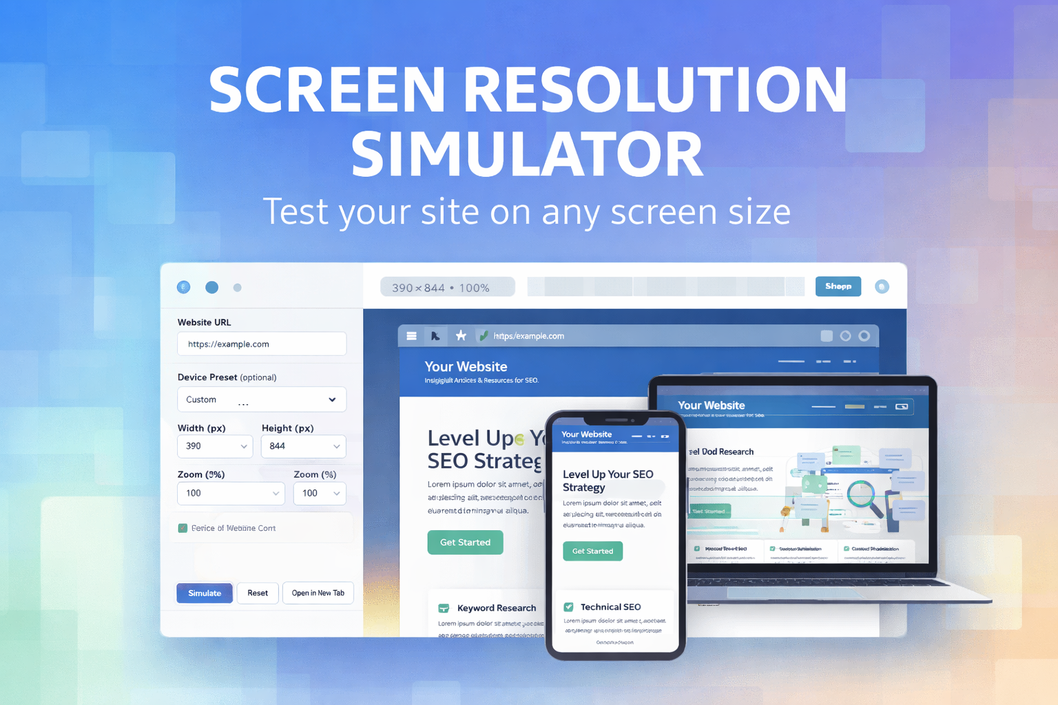
A screen resolution simulator is an online tool that displays a website inside a resizable frame with specific width and height dimensions. These dimensions simulate the screen size of real devices such as smartphones, tablets, laptops, and desktop monitors.
Instead of relying on guesswork or switching between multiple devices, you can instantly preview how your website behaves at resolutions like:
-
375×667 (mobile phones)
-
768×1024 (tablets)
-
1366×768 (laptops)
-
1920×1080 (full HD desktops)
This makes screen resolution testing faster, more efficient, and far more accessible.
Why Screen Resolution Testing Is Critical in 2026
1. Mobile-First Indexing Is the Standard
Google now primarily evaluates websites based on their mobile version. If your site looks broken, unreadable, or difficult to navigate on smaller screens, your rankings can suffer—even if the desktop version looks perfect.
Using a screen resolution simulator helps ensure that your mobile layout meets modern usability and accessibility standards.
2. User Experience Directly Affects SEO
User experience (UX) signals such as:
-
Time on page
-
Bounce rate
-
Scroll behavior
-
Interaction with content
are heavily influenced by how well your site adapts to different screen sizes.
A responsive design that works smoothly across devices improves engagement and sends positive signals to search engines.
3. Devices and Screen Sizes Keep Expanding
Modern users browse the web on:
-
Foldable phones
-
Large tablets
-
Ultra-wide monitors
-
High-resolution laptops
A screen resolution simulator lets you test edge cases that are often ignored during development.
Who Should Use a Screen Resolution Simulator?
A professional screen resolution testing tool is valuable for many roles:
Web Developers
Developers use screen resolution simulators to:
-
Test responsive layouts
-
Detect overflow and horizontal scrolling
-
Verify CSS media queries
UI/UX Designers
Designers rely on simulators to:
-
Ensure consistent spacing and typography
-
Validate button sizes and tap targets
-
Maintain visual hierarchy across devices
SEO Specialists
SEO professionals use screen resolution testing to:
-
Improve mobile usability
-
Fix layout-related SEO issues
-
Optimize Core Web Vitals performance
Website Owners & Marketers
Even non-technical users can:
-
Preview landing pages before campaigns
-
Test conversion elements on mobile
-
Identify UX problems early
Key Features of a Professional Screen Resolution Simulator
Not all simulators are created equal. A high-quality tool should provide:
-
Custom width and height input
-
Popular device presets
-
Zoom controls
-
Live preview using real URLs
-
Fast loading without browser extensions
The SEOcraft Screen Resolution Simulator includes all of these features in a clean, user-friendly interface.
👉 Access it here:
https://www.seocraft.io/tools/screen-resolution-simulator/
How the SEOcraft Screen Resolution Simulator Works
Using the tool is straightforward:
-
Enter your website URL
-
Choose a device preset or enter custom dimensions
-
Adjust the zoom level if needed
-
Instantly preview how your site appears at that resolution
The tool loads your website inside a preview frame, allowing you to visually inspect layout behavior without modifying your site in any way.
This makes it ideal for quick testing, audits, and demonstrations.
Screen Resolution Simulator vs Browser Developer Tools
Many developers ask: Why not just use browser DevTools?
While browser DevTools are powerful, a dedicated screen resolution simulator offers advantages:
| Feature | Screen Resolution Simulator | Browser DevTools |
|---|---|---|
| No setup required | ✅ | ❌ |
| Easy sharing with clients | ✅ | ❌ |
| Clean preview without overlays | ✅ | ❌ |
| Works for non-developers | ✅ | ❌ |
For fast checks and client-friendly previews, an online simulator is often the better choice.
SEO Benefits of Using a Screen Resolution Simulator
Improved Mobile Usability
Testing mobile layouts helps eliminate issues like:
-
Text that’s too small
-
Buttons placed too close together
-
Content that overflows the screen
Better Core Web Vitals
Responsive layouts reduce layout shifts and rendering problems that negatively affect metrics like CLS (Cumulative Layout Shift).
Higher Conversion Rates
A layout that looks good and works well on all devices naturally converts better, especially on mobile traffic.
Common Problems a Screen Resolution Simulator Can Reveal
Using a screen resolution simulator often uncovers issues such as:
-
Hidden navigation menus on mobile
-
Images overflowing containers
-
Forms that are hard to complete on small screens
-
Fixed-width elements breaking responsive layouts
Identifying these problems early saves time, money, and potential SEO penalties.
Best Practices for Screen Resolution Testing
To get the most value from a screen resolution simulator:
-
Test your homepage first
-
Check key landing pages and blog posts
-
Test forms and interactive elements
-
Use multiple breakpoints, not just one
-
Re-test after design or content changes
Consistency is key. Responsive design is not a one-time task.
Why Choose the SEOcraft Screen Resolution Simulator?
The SEOcraft Screen Resolution Simulator is built specifically for performance, usability, and SEO professionals. It offers:
-
Fast, clean previews
-
Popular device presets
-
Custom resolution support
-
No registration required
-
A lightweight, ad-friendly interface
You can start testing immediately without installing any extensions or software.
👉 Start testing now:
https://www.seocraft.io/tools/screen-resolution-simulator/
Final Thoughts
A screen resolution simulator is no longer an optional tool—it’s a necessity in modern web development and SEO. As device diversity continues to grow and mobile-first indexing dominates search results, testing your website across screen sizes is essential for success.
Whether you are a developer, designer, SEO expert, or website owner, using a reliable screen resolution simulator can help you build better websites, improve user experience, and achieve stronger search engine performance.
If you’re looking for a fast, accurate, and easy-to-use solution, the SEOcraft Screen Resolution Simulator is a powerful choice.
🔗 Test your site across all screen sizes here:
https://www.seocraft.io/tools/screen-resolution-simulator/